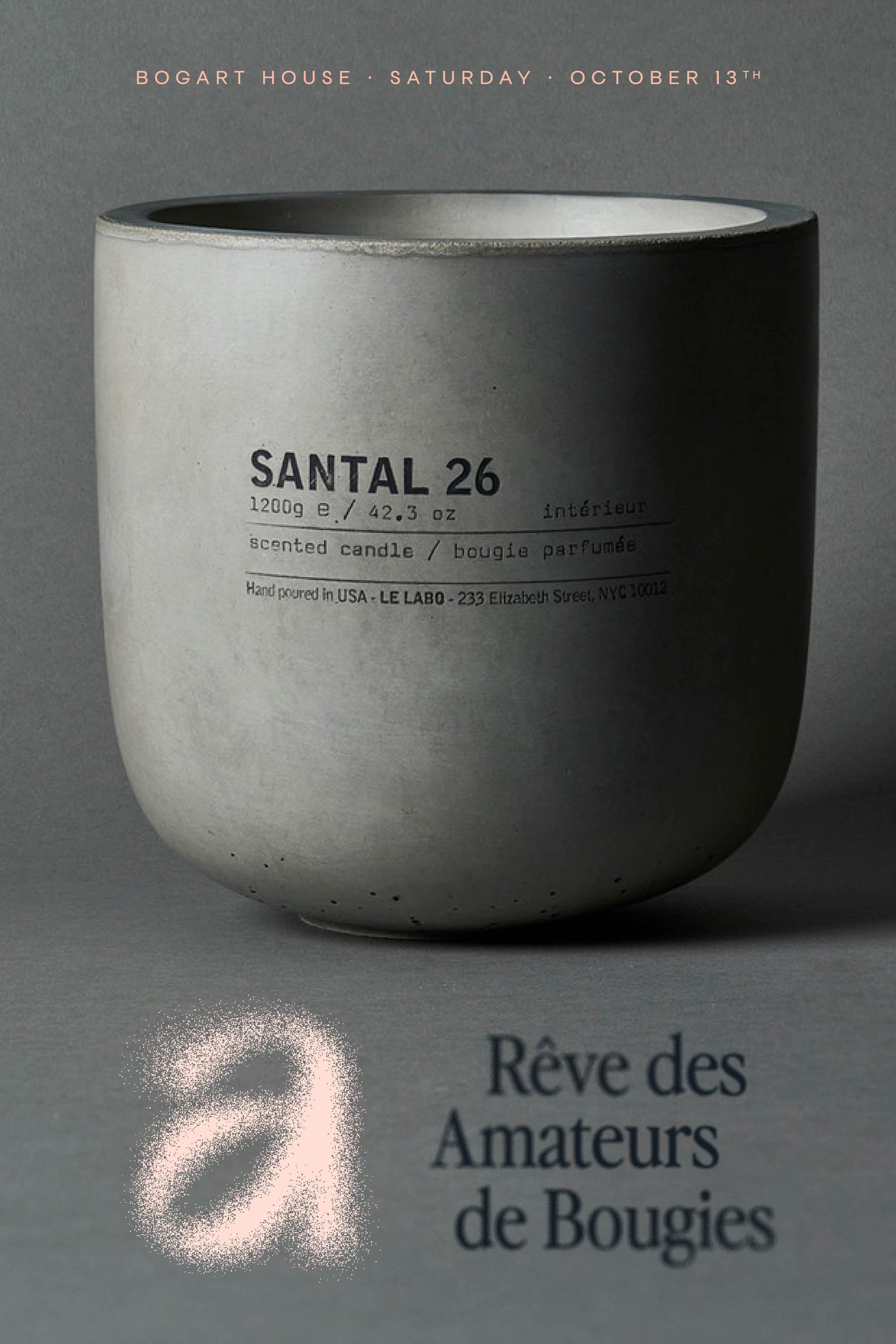
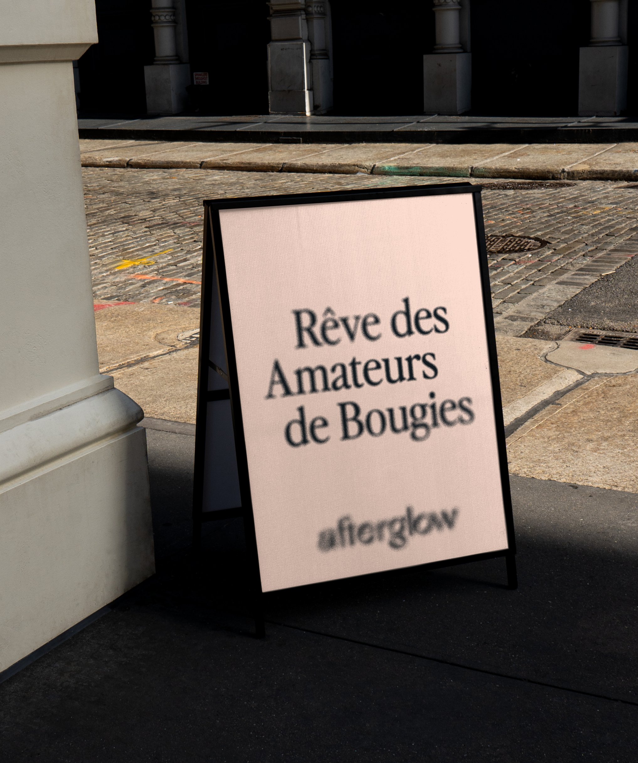
As a designer passionate about creating bespoke experiences, I had the unique privilege of crafting the visual identity for a luxury candle festival.
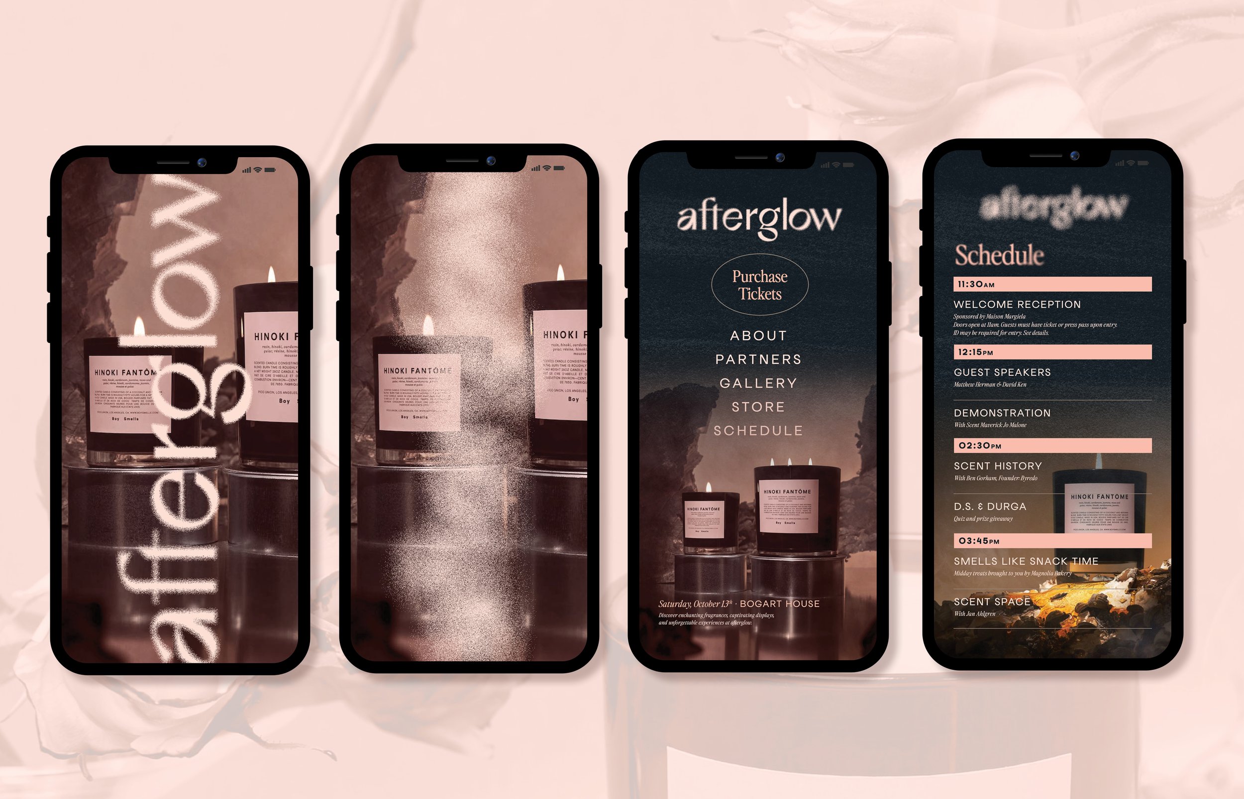
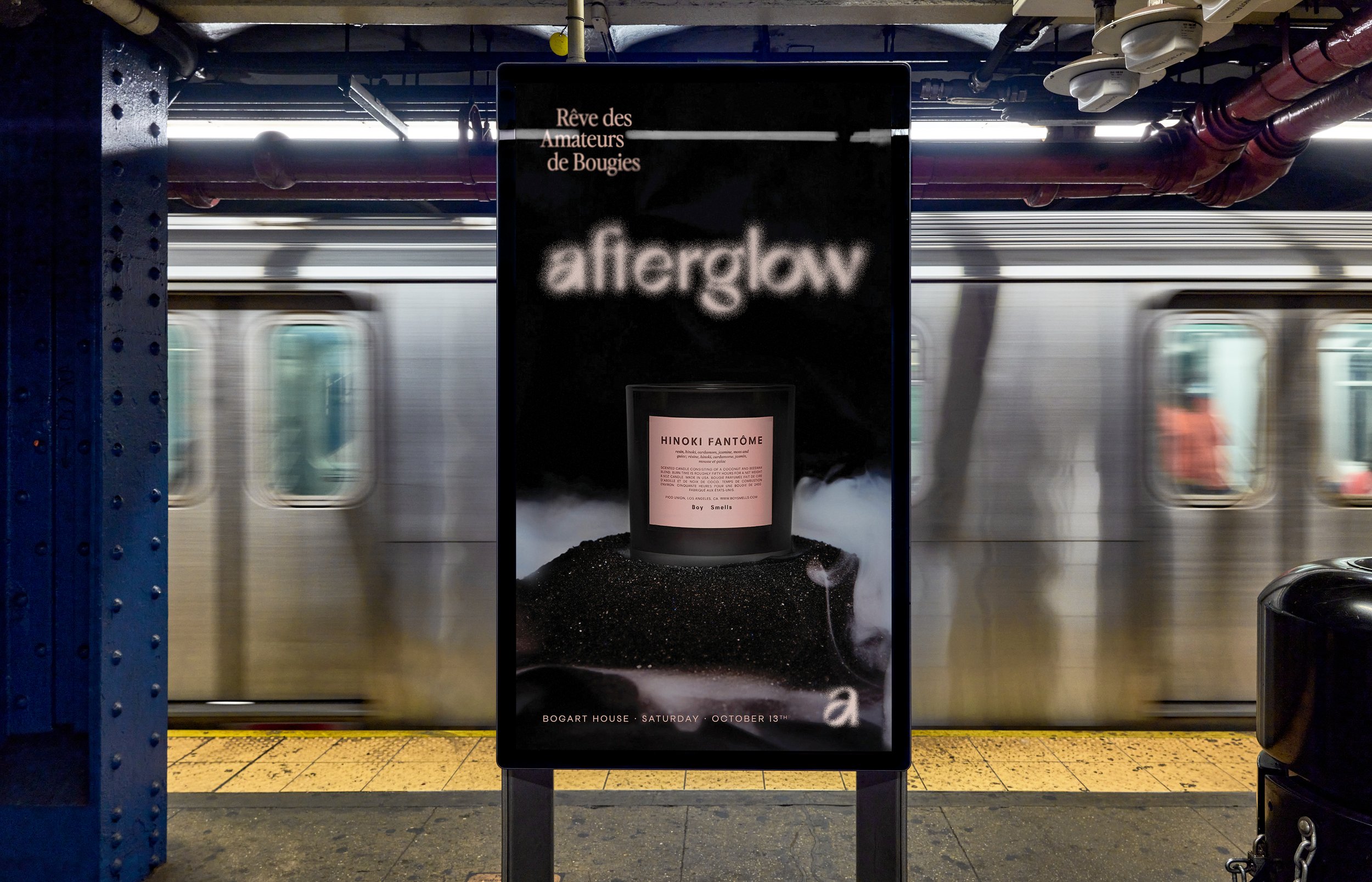
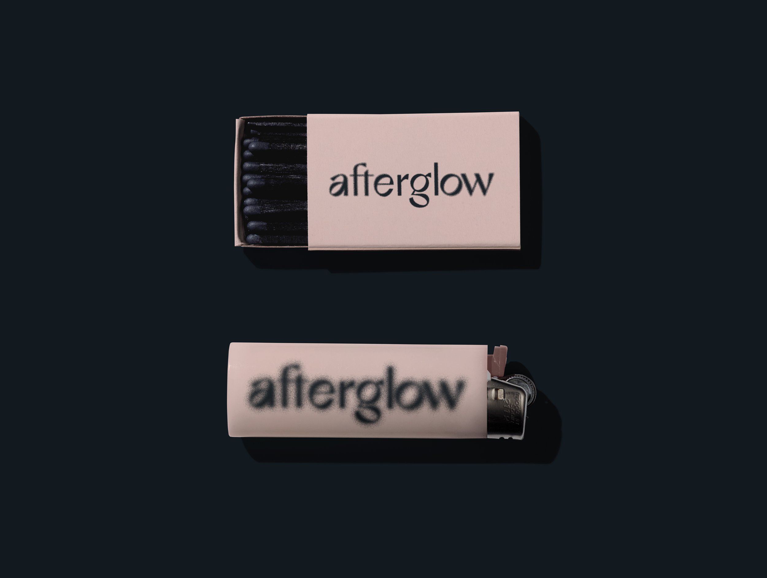
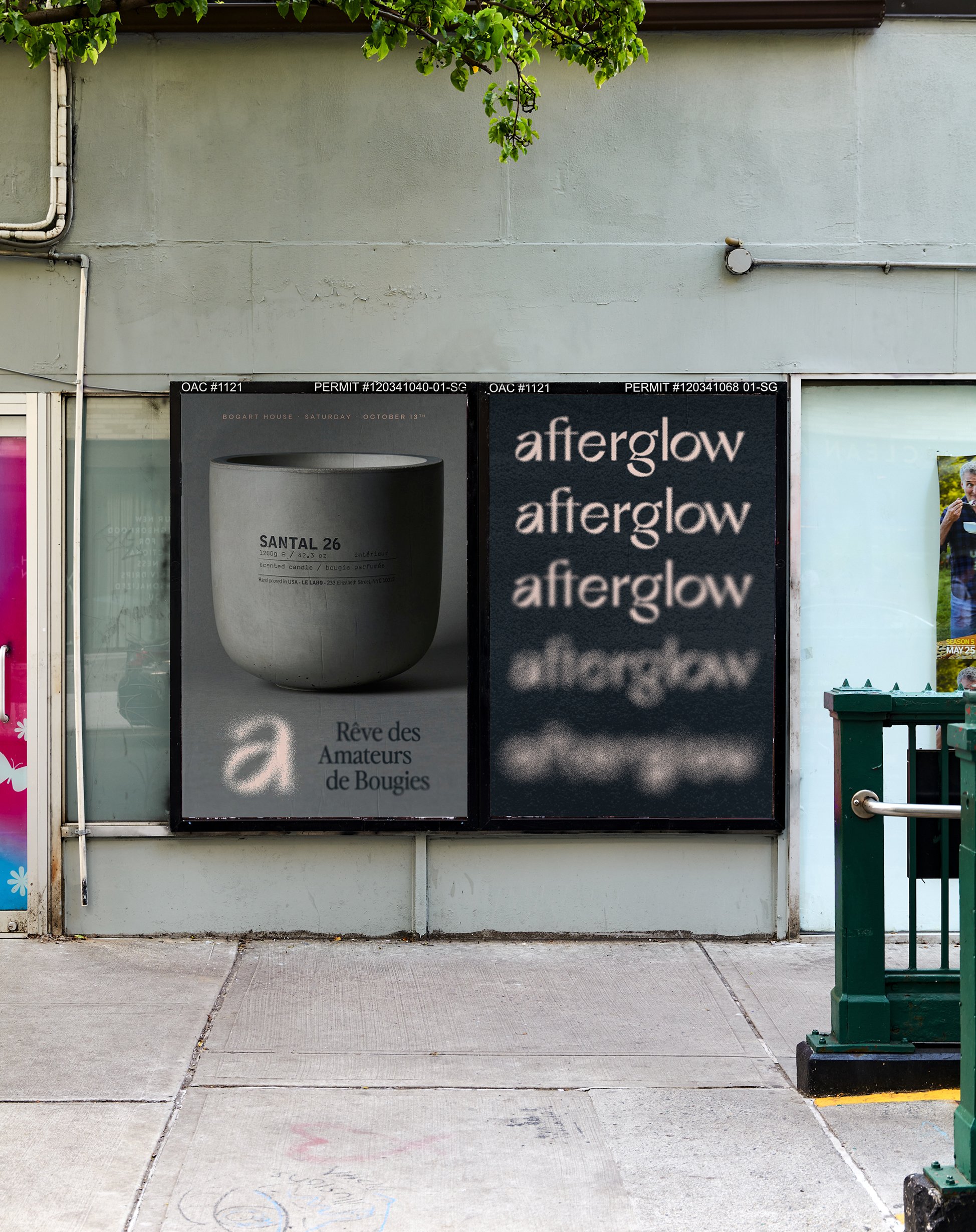
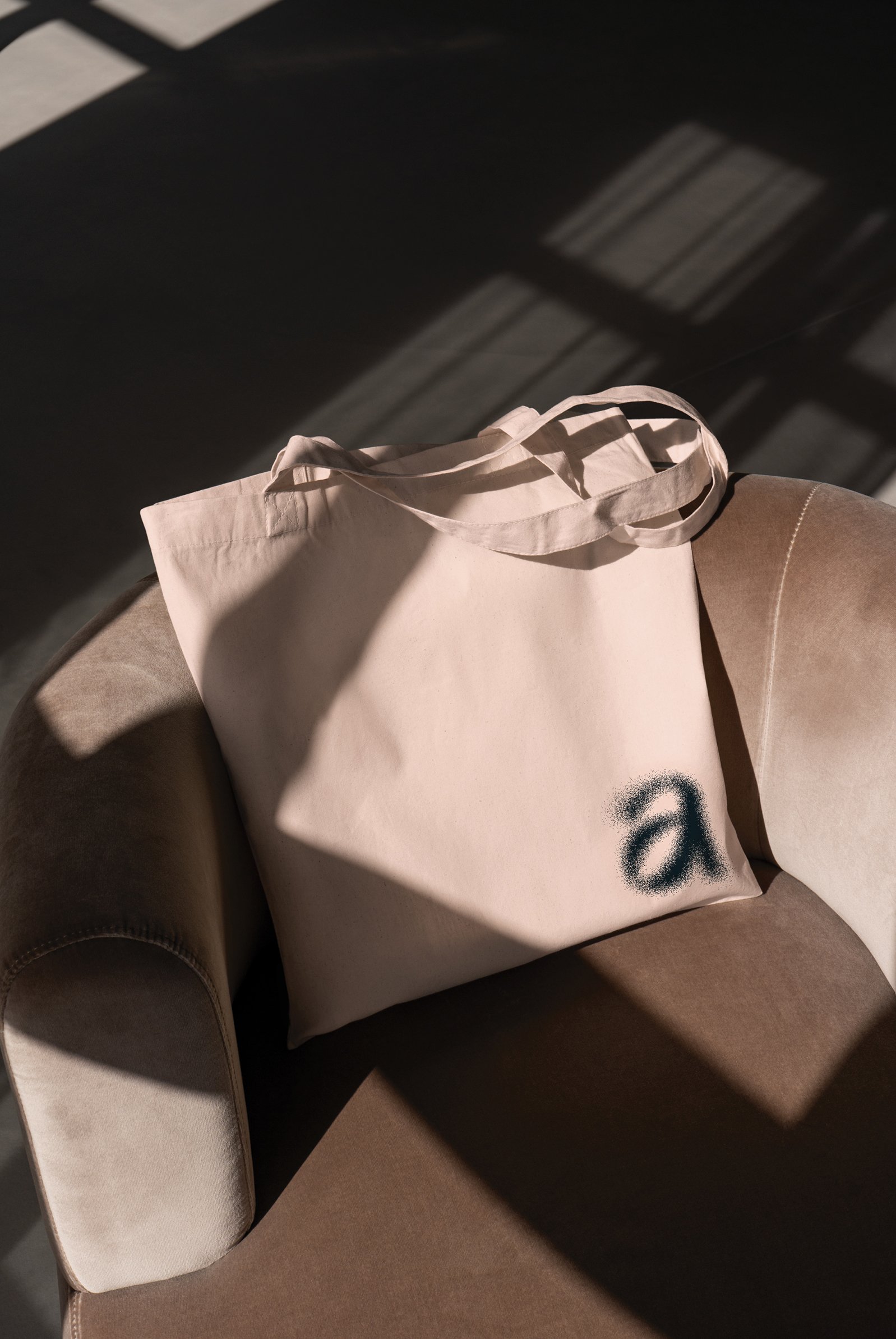
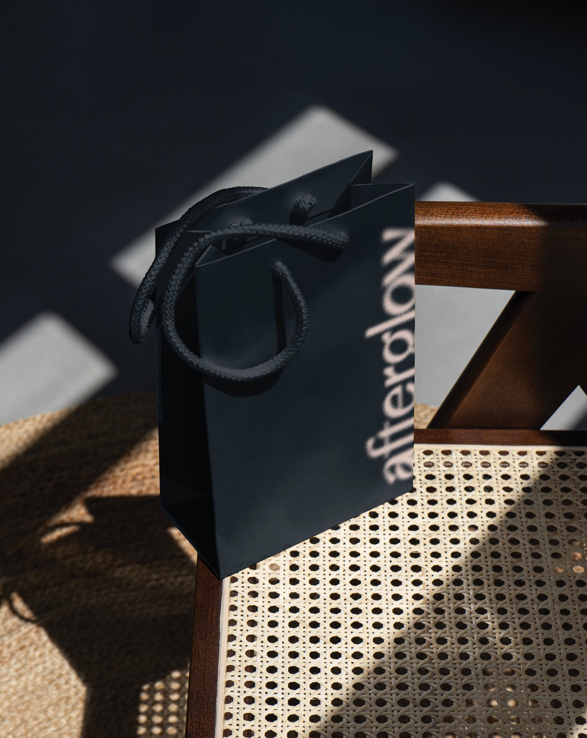
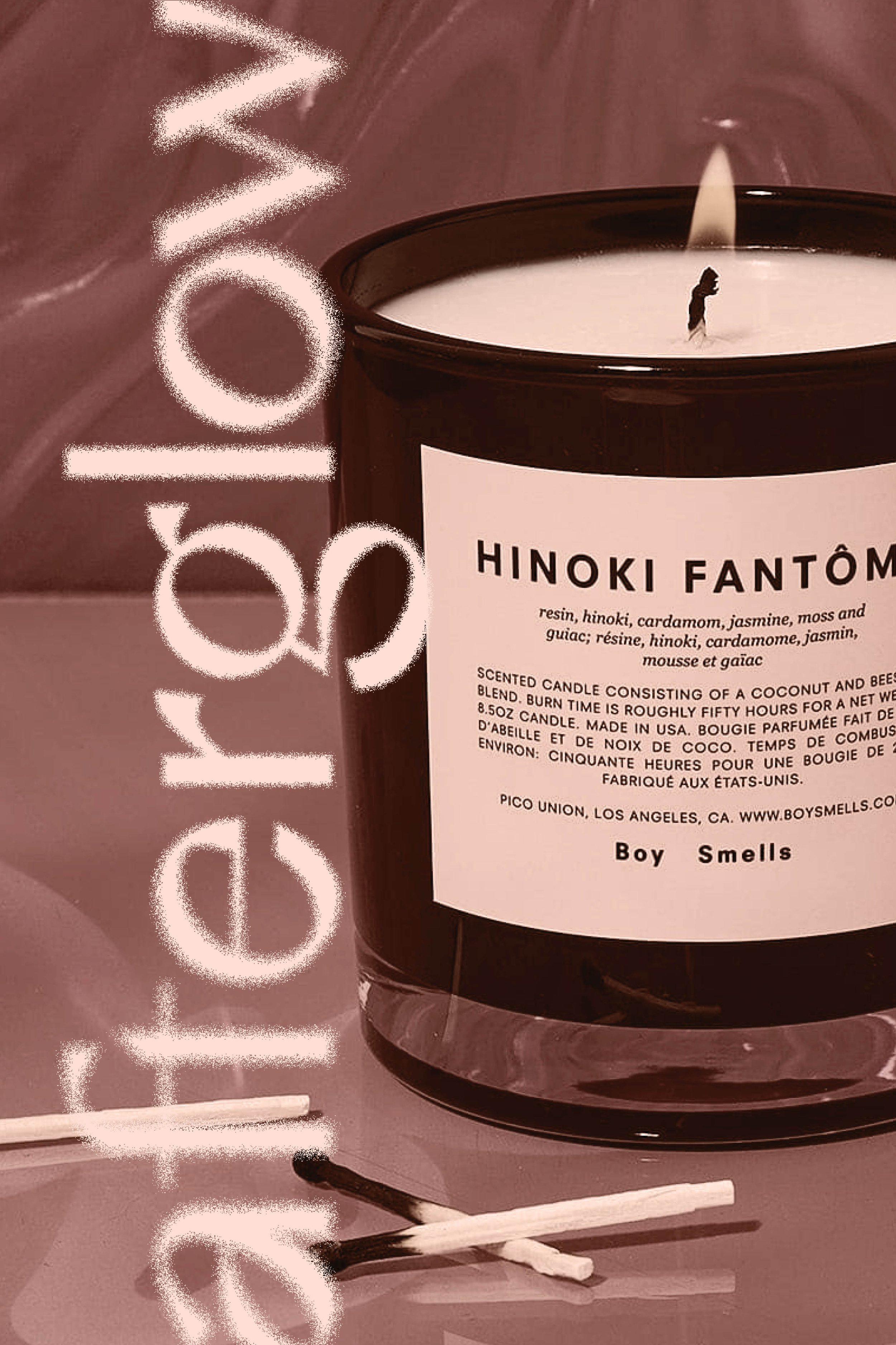
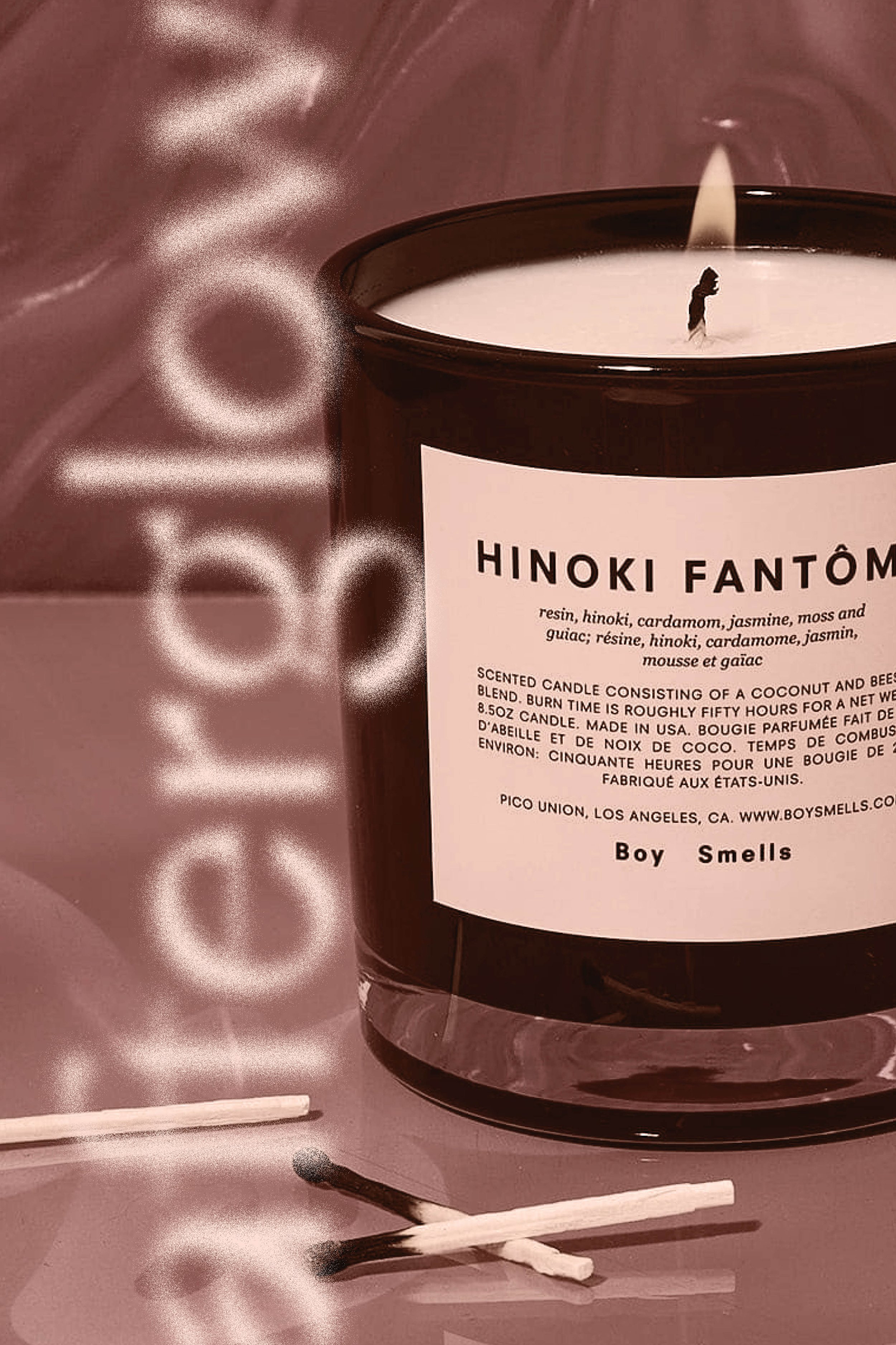
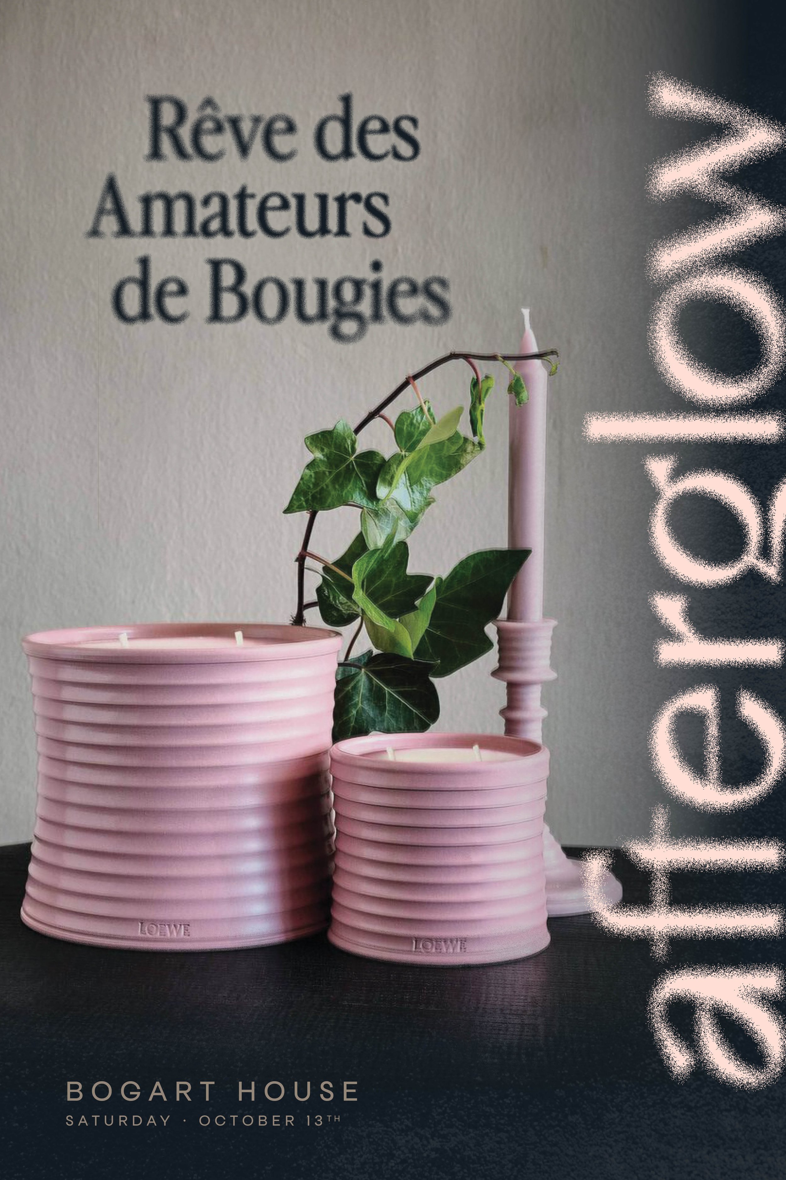
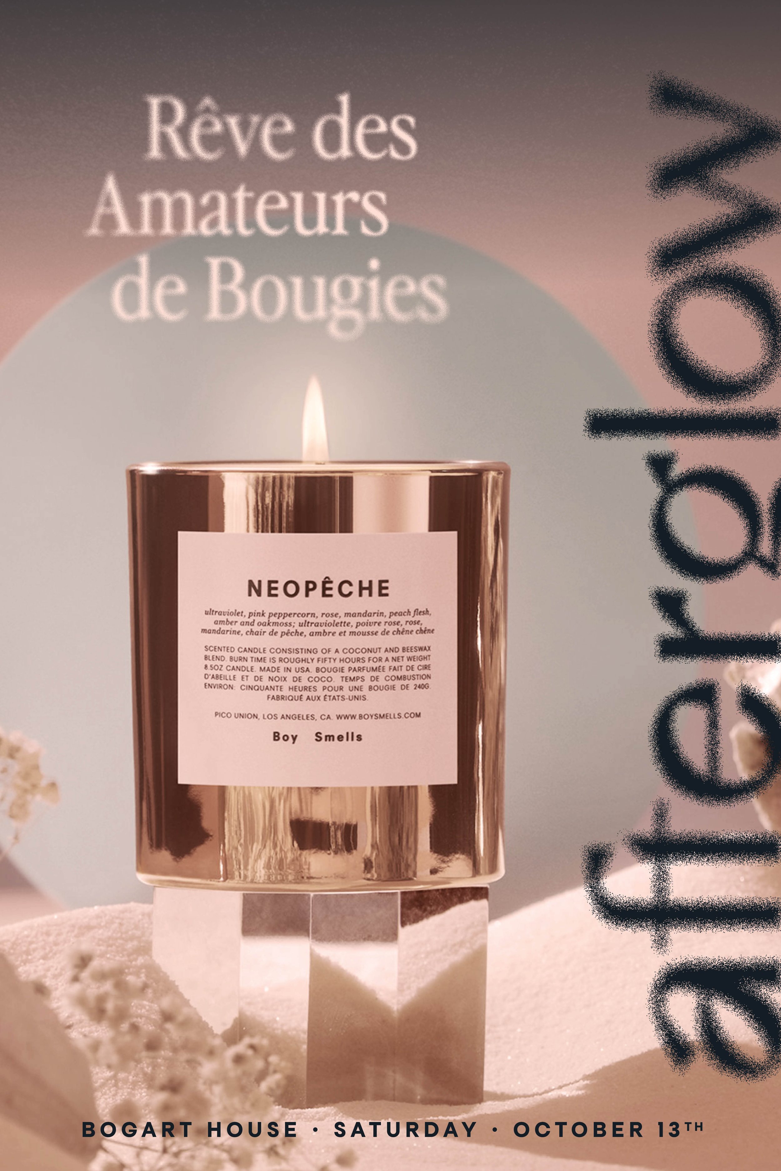
The logo captures the festival's spirit of elegance and illumination. The color palette, features a dark blue color dubbed as “mod-night” which was inspired by the soft hues of darkness behind a flickering candlelight. The creamy pinks evoke a sense of tranquility.
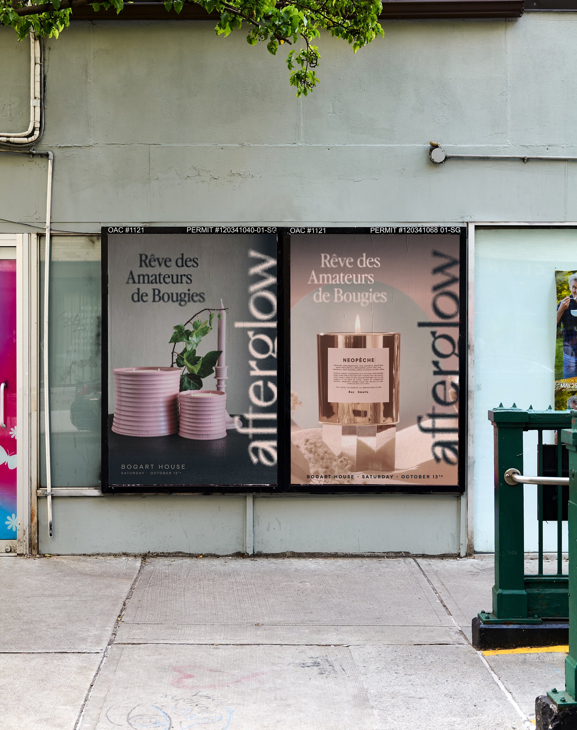
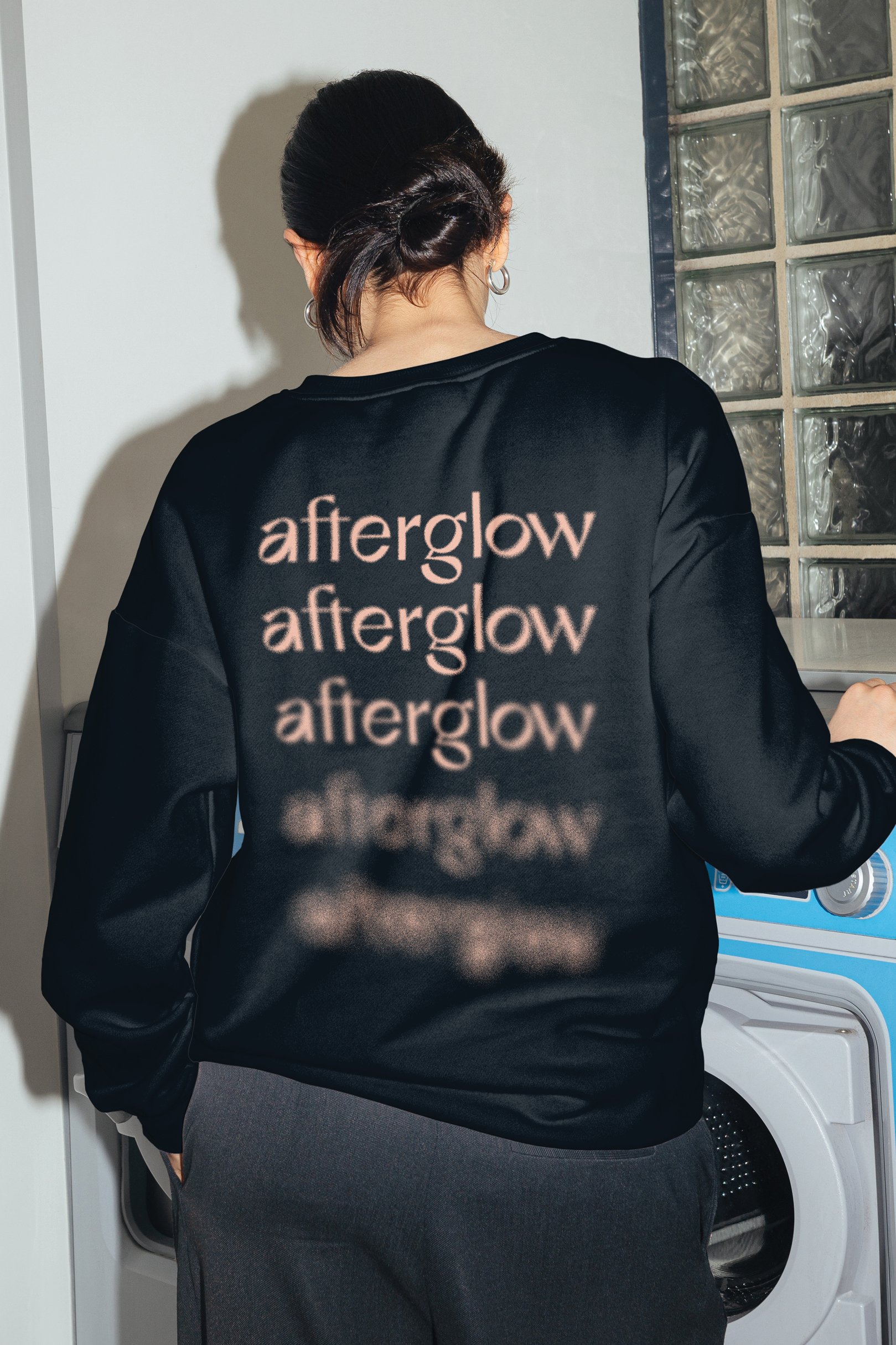
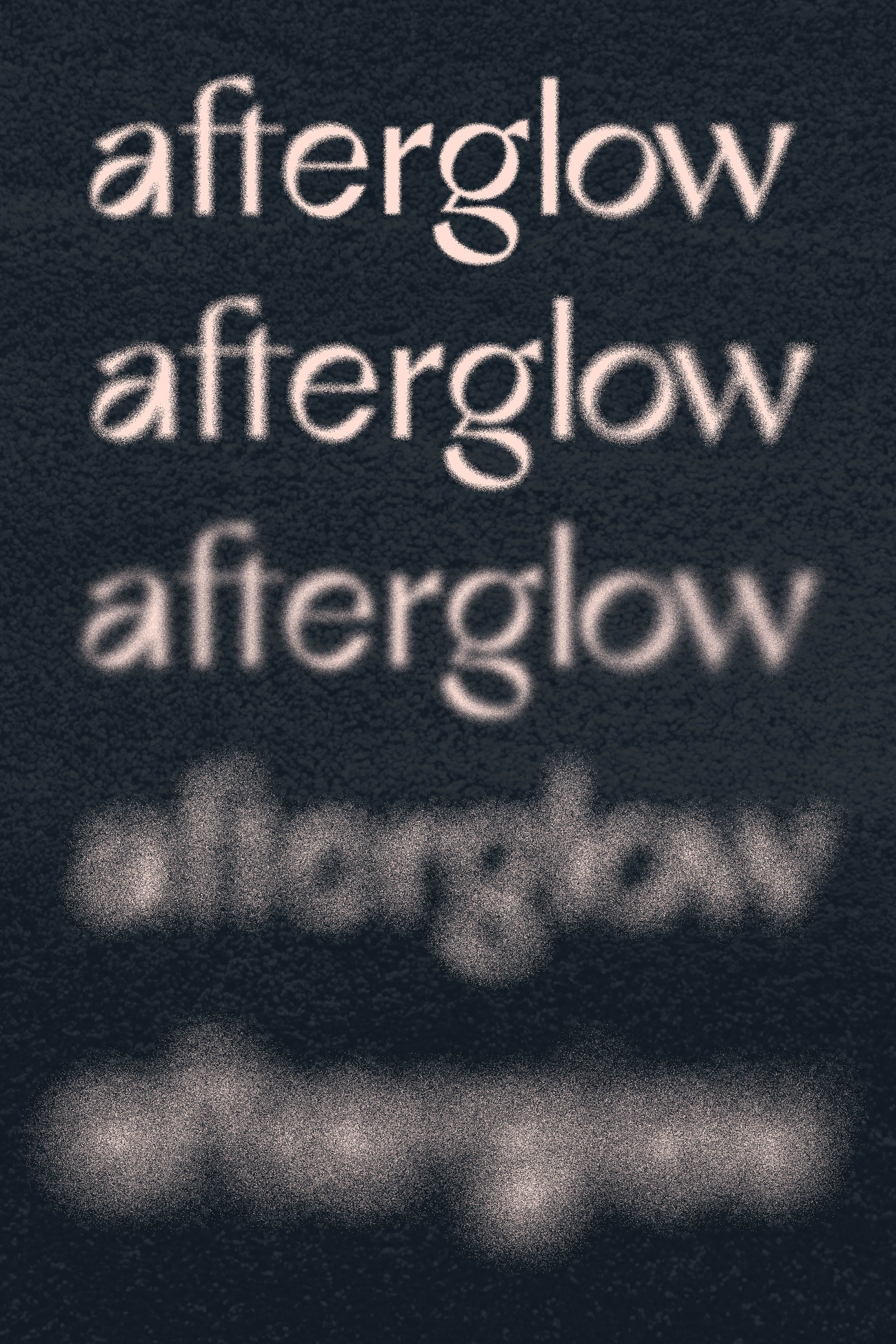
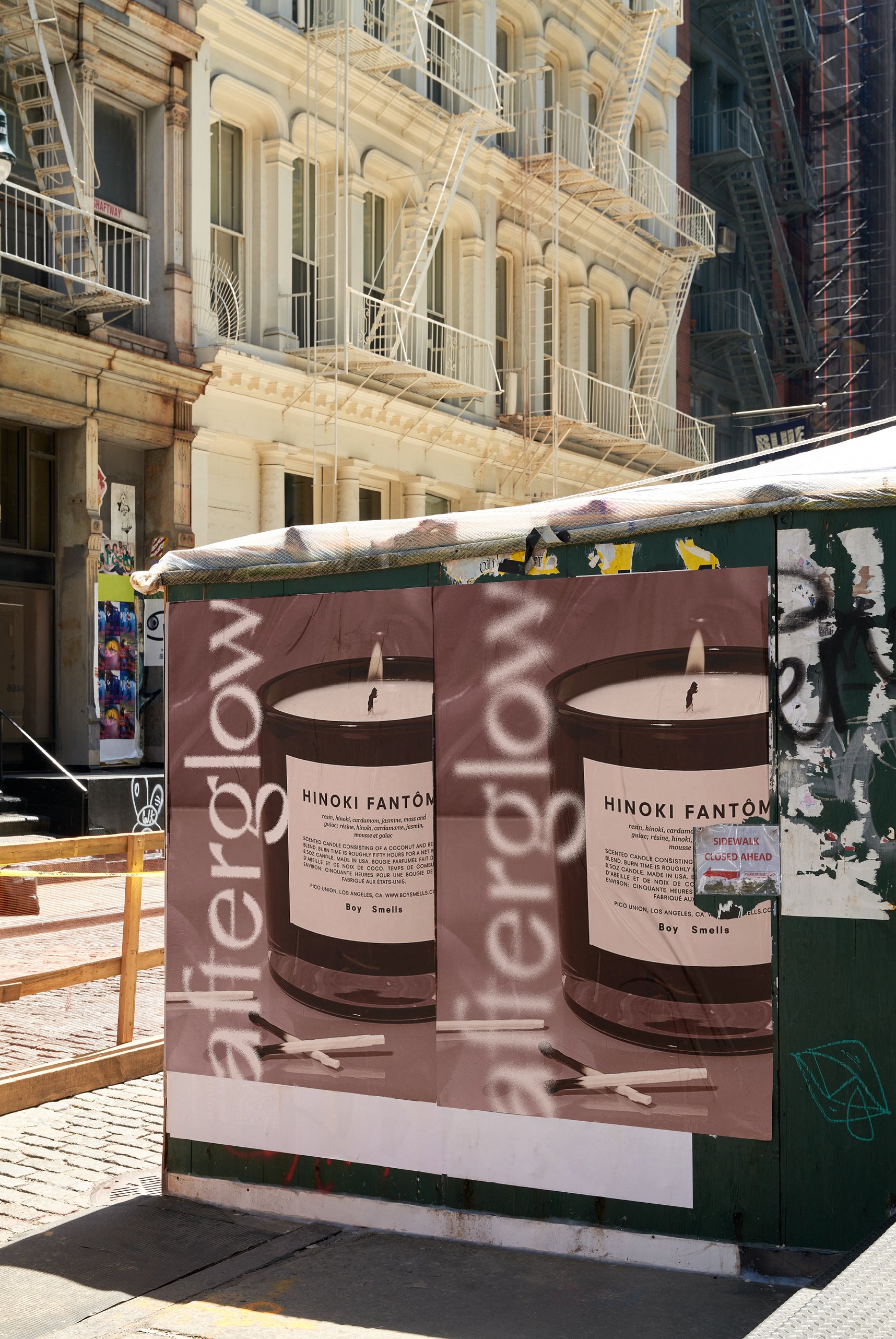
Every element of the branding, from promotional materials to digital assets, is designed to immerse audiences in the experience of afterglow. Visual elements fade in an out of a hazy glow, much like that of the afterglow of a candle that’s been extinguished. It's more than just a visual identity; it's an invitation to experience moments of beauty and heightened senses.
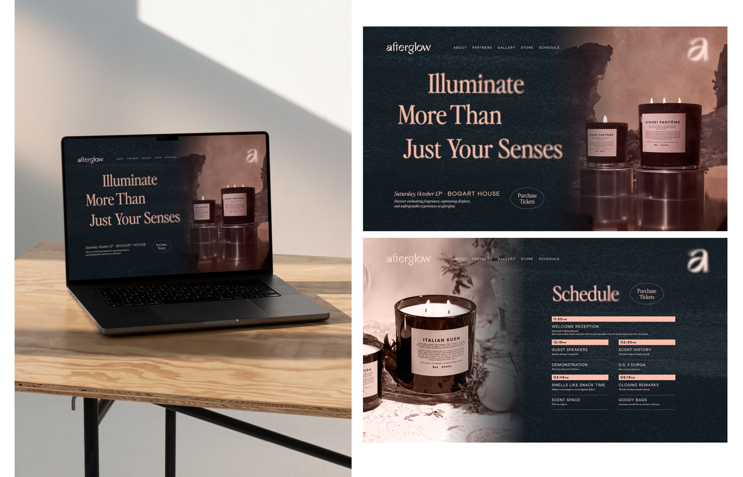
In an effort to seamlessly carry the visual identity into the digital space, we imposed the hazy effects through photography as well.